Some Thoughts on Interfaces
The way we’ve interacted with computers has evolved considerably - from the early days of punch cards fed into a giant, room sized machine to the command line interface, to the Graphical User Interface developed at PARC (and subsequently popularized by Apple, and eventually Microsoft), to multitouch-based smartphones, to emerging computing paradigms like Augmented-Reality, Virtual-Reality, and ubiquitous computing.
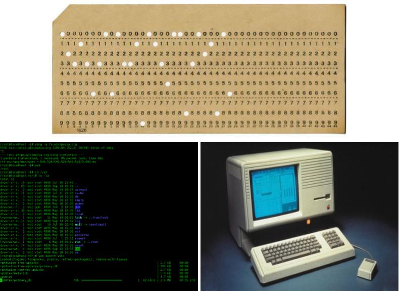
Top: https://www.computerhistory.org/revolution/punched-cards/2
Bottom Left: https://en.wikipedia.org/wiki/Command-line_interface
Bottom Right: https://www.extremetech.com/computing/104661-how-steve-jobs-stole-the-mouse-and-gui-video
As the field of computing has marched on, we have learned that there is a tension between wanting our interfaces to be more intuitive and at the same time help us accomplish a wider variety of ever more complex tasks.
We want to instantly grasp how to use interfaces without any instruction, even as we hope to be able to solve increasingly complex problems. One of the great myths of interface design is that all interfaces must be simple, and that everything should be immediately intuitive. But these aims are often contradictory - just because something is simple in its visual layout does not mean it will be intuitive! Intuitiveness also is extremely culturally relative - something that may be visually intuitive in one culture, for example, may not be in another; because of everything from language layout, to the role of color, and even the way different cultures process the passing of time.
If we are to empower users to accomplish complex tasks through software, the interface itself may have to be complex. That is not to say that the interface has to be difficult to use! Complex interfaces should, instead, guide the user to an understanding of their capabilities and operation while still keeping them in a flow state. Regardless of how complex the interface is, or the point in the path when the user is learning to use it, they should still be actively engaged in the process, and not become discouraged or feel overwhelmed by the complexity. Interfaces should not shy away from complexity, but should instead guide and assist the user in understanding the complexity - leaving them empowered, not feeling frustrated.
Skill Floors and Skill Ceilings
A piece of software with a low skill floor and a high skill ceiling is one in which it is very easy to get started for very simple tasks, without having to do a lot of research or manual reading to figure out how to get started.
At the same time, the software should offer enough functionality such that should a user take the time to learn how to use it, they will be able to accomplish more complex tasks the more time they spend learning the software.
CAD software is a good example of what a high floor and a high ceiling looks like. CAD software allows users to accomplish very complex and sophisticated design tasks at a very intricate level of detail. However, they also have a very high floor - they require users to put in a lot of time and effort into learning how to use them to accomplish even the most basic tasks. Additionally, CAD software assumes the user has domain specific knowledge from an engineering or design discipline in order to use the software properly.
Might it be possible for future software tools with high floors to assist new users with acquiring that domain knowledge the more they use the tool?
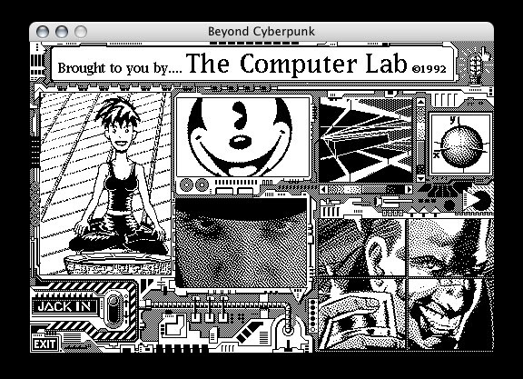
https://arstechnica.com/gadgets/2019/05/25-years-of-hypercard-the-missing-link-to-the-web/
HyperCard was a piece of software that was inspired by an LSD trip (not microdosing for worker productivity, but rather the hippy kind of encounter), and was truly ahead of its time. HyperCard allowed Mac users to create mini programs out of a card based interface. It’s creator, Macintosh legend Bill Atkinson, described it as a “…software erector set that lets non-programmers put together interactive information”. It allowed people to make mini programs without ever having to write a line of code - in 1987.
These tools have low floors because people can get started using them with little to no domain experience or guidance and training using the tools. However, because they rely so much on high level abstractions, they also have low ceilings - the user may not be able to accomplish more complex tasks within the tool’s abstractions, and so hit the skill ceiling of the tool. Doing more would require diving deeper into a level of abstraction that the tool doesn’t support; having hidden it in further higher levels of abstraction that make the tool easy to use in the first place.
An example of software with a low floor and a high ceiling is Microsoft Excel. The classic spreadsheet program has a low floor in that users can quickly create very simple spreadsheets with little learning time required, and a high ceiling that allows users to do sophisticated financial, statistical, and scientific modelling with Excel. The same program is used for simple household budgeting and sophisticated epidemiological modeling.
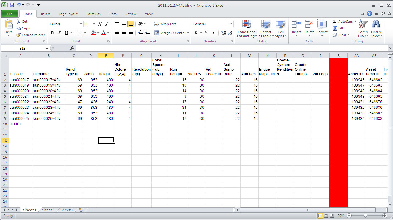
https://www.britannica.com/technology/Microsoft-Excel
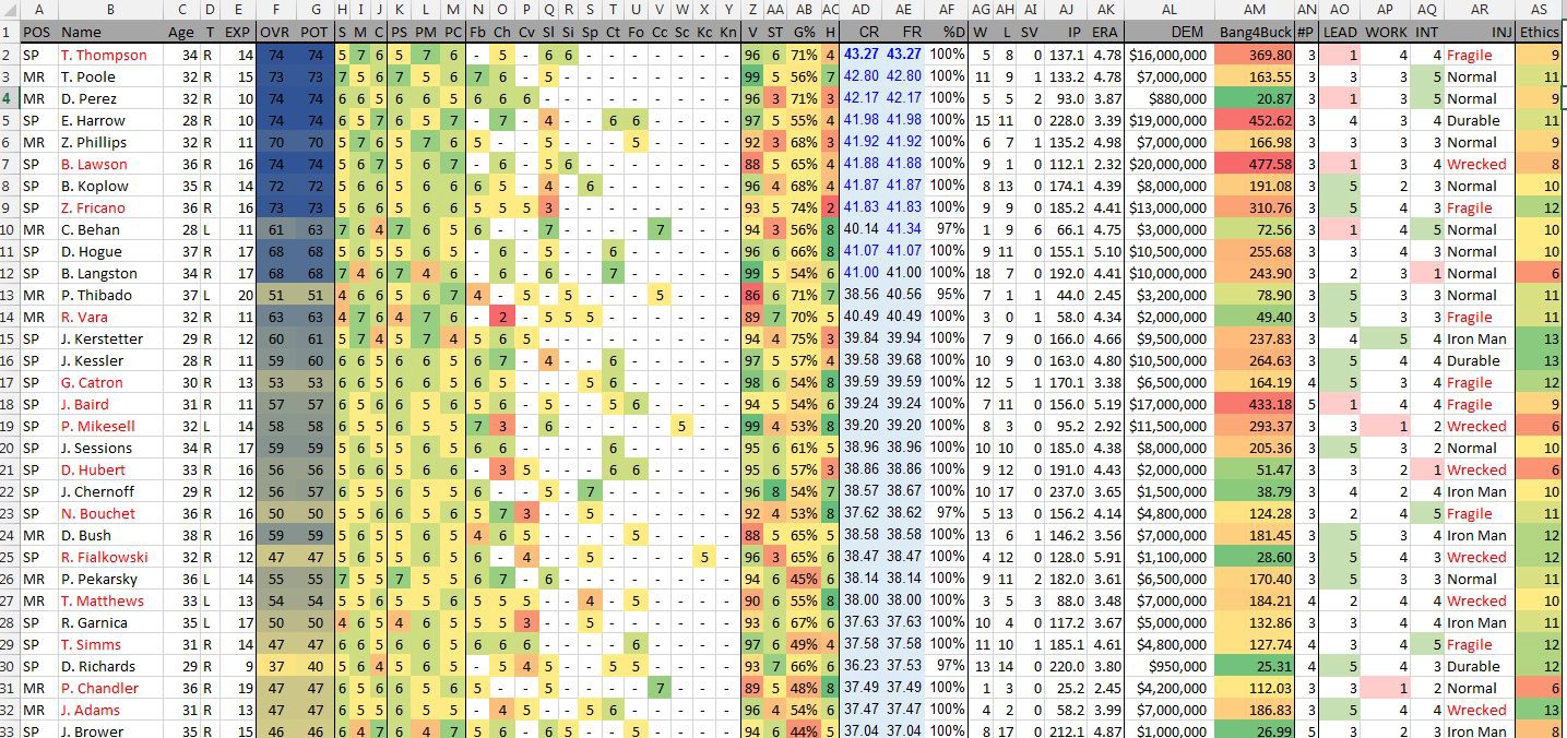
https://medium.com/@pbbrown1112/outgrowing-microsoft-excel-8d16bf41f022
Another example in the same category would be Ableton Live, a popular program for musicians, producers, and sound designers. It’s very easy to get started making cool sounds right away, even if you have no knowledge of music theory, composition, or sound synthesis.
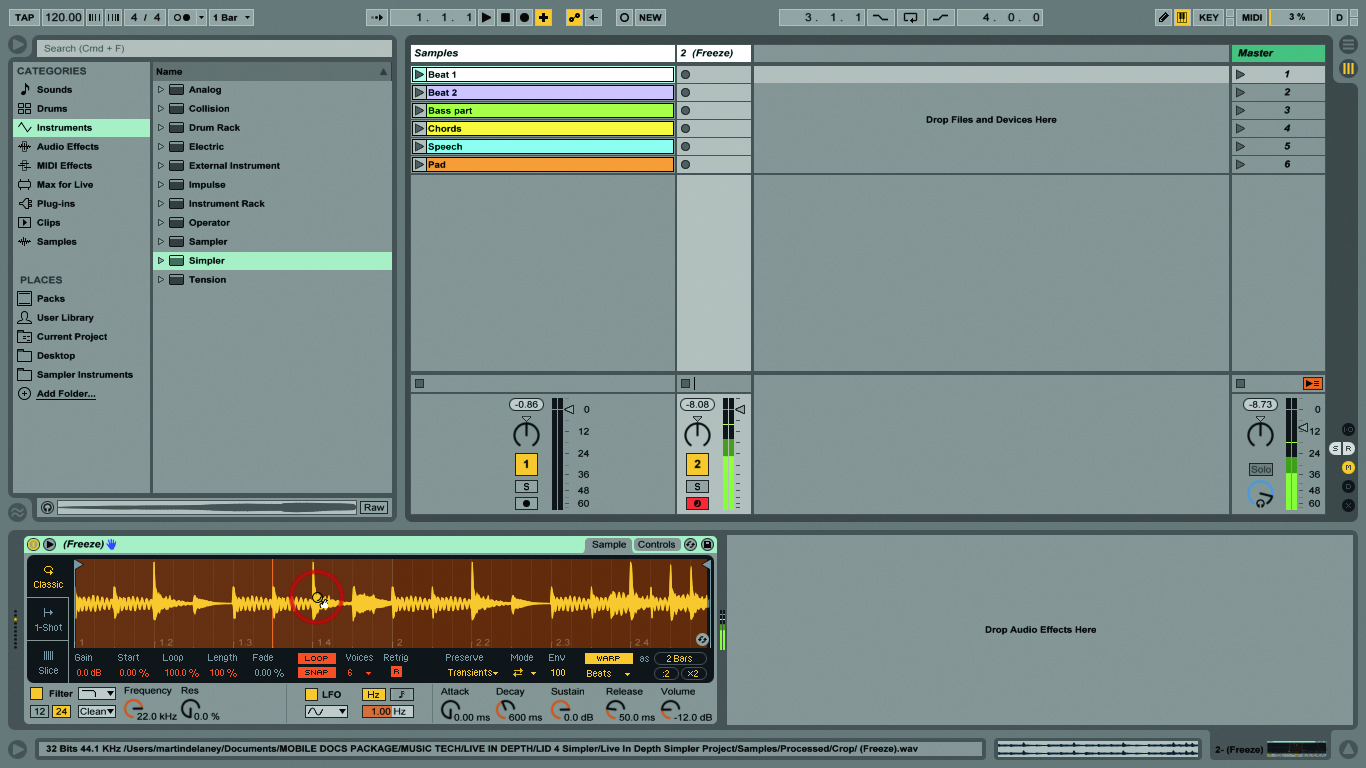
https://www.musictech.net/tutorials/ableton-live-tutorial-the-simpler-instrument/
However, if you put time into learning its intricacies, the more in-depth you’ll be able to go with making music with it.
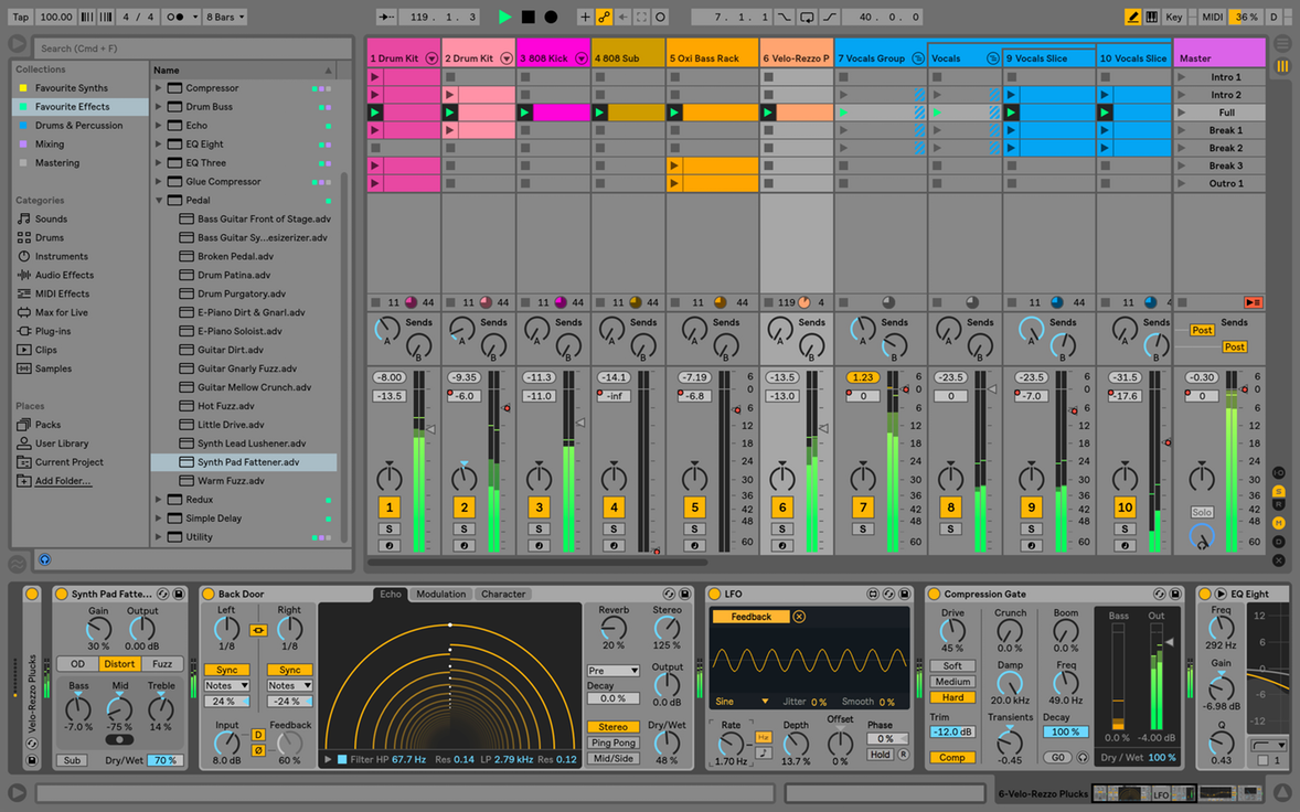
https://sonicscoop.com/2018/06/13/make-switch-5-ways-get-ableton-live/
An important question to consider is, what’s between the floor and the ceiling? How should we software designers help the user get from the floor to the ceiling as their knowledge grows and their needs become more complex over time?
Currently, people use all kinds of things to learn how to use software - YouTube tutorials, books, magazines, blogs, live streaming, webinars…it’s worth asking ourselves, why does software not support learning how to use the software inside the software itself? Why don’t we allow software to teach its users how to use it, without having to rely on these external sources? What would allow for this change to occur?
A possible answer to that question are adaptive interfaces; parts of software that learns a user’s pattern of usage over time and learns what tasks they want to accomplish further, and provides assistance that helps them get there, guiding them from the floor to the ceiling.
Adaptive Interfaces
Phones, tablets, and computers carry ever more powerful sensors that are capable of gathering rich streams of data about the world. Cameras, microphones, GPS sensors, accelerometers, gyroscopes, magnetometers, LiDAR, radar. All of these things can be used to provide context for how a user is interacting with the software that’s running on that device.
These devices are also becoming capable of running more powerful ML models locally; without having to connect to a cloud server that’s running the model and the increased latency that it introduces. These models can be trained on the rich data streams from a device’s sensors, and be used to determine how a user is interacting with their device and the software applications running on it. Depending on the context, on-device ML models could be used to adjust the software interface according to the needs of the person using it.
This allows for interfaces to become more dynamic, adapting to individual users’ preferences and behavior over time, rather than remaining static and uniform. As users learn to use the software, the software learns how they use it, and can adapt itself accordingly. The reasons for these adaptations should be transparent to the user - they should always be able to see how their actions influenced the software’s behavior and responses to them, and easily reverse them should they choose.
UI Latency
Another area of contemporary software development that feels exceptionally frustrating; one in which we seem to have regressed, is that of User-Interface latency.
If a user is in a flow state while using a computer, they’re focused on accomplishing the task at hand; thinking about interacting with the model of the data they’re acting on, rather than thinking how to use the interface to manipulate that data.
Latency takes users out of a flow state, forcing them to wait for their computer to finish doing something until they’re able to get back to the task at hand.
Interface latency can also reduce a user’s trust in their software (and their computer), by causing them to guess why the program is slow, unstable, or unusable; rather than spending their time using the interface to accomplish whatever their task at hand is.
Jakob Nielsen offers the following advice on user-interface response times:
-
0.1 second is about the limit for having the user feel that the system is reacting instantaneously, meaning that no special feedback is necessary except to display the result.
-
1.0 second is about the limit for the user’s flow of thought to stay uninterrupted, even though the user will notice the delay. Normally, no special feedback is necessary during delays of more than 0.1 but less than 1.0 second, but the user does lose the feeling of operating directly on the data.
-
10 seconds is about the limit for keeping the user’s attention focused on the dialogue. For longer delays, users will want to perform other tasks while waiting for the computer to finish, so they should be given feedback indicating when the computer expects to be done. Feedback during the delay is especially important if the response time is likely to be highly variable, since users will then not know what to expect.
As computing continues to evolve and advance in raw power, our interfaces need to stay up to speed so that people never feel like they can’t master their technology; that it’s never something beyond their grasp or incapable of controlling. With increasingly large amounts of data, and the corresponding machine learning systems that try to make sense of it, our interfaces need to be able to help us to make sense of that data and machine learning models so that we will not get left behind the power of these tools and the complexity of the problems that we are trying to solve with them.
The goal when creating these interfaces should be to help users get into a flow state as quickly as possible, and keep them from being distracted because of things like latency or them trying to find whatever it is they’re looking for by poking around aimlessly because an interface is poorly designed. When they’re in a flow state, users will be concentrating on the task at hand, rather than trying to figure out how to use the interface to accomplish their task. This isn’t to say that no time will need to be spent learning how to use the interface, but, the amount of learning required should decrease over time. These are not impossible problems to solve, quite the opposite. In fact, it’s a damning indictment of the state of interfaces that things like latency are still an issue that need to be discussed at all!
Final Thoughts
Interfaces are our gateway to working with computers. They’re how we’re able to take the raw power of a computer and use it to browse the internet, calculate expenses in a spreadsheet, or play a video game.
They should help users accomplish their goals without getting in the way. They should be suited to the task at hand, and let the user focus on that task. They do not necessarily need to be simple, as sometimes the thing the user may be trying to accomplish is quite complex; but, they should be able to afford the user a clear understanding of their mechanics and operation. Complex interfaces should still be easy to learn - just because something is complex, does not mean that the path to learning how to use it should be one that is difficult or frustrating. Complex interfaces should help guide the person using them on their mechanics and usage, while keeping them in a flow state.
They should not always be static - when appropriate, interfaces should learn how individual users use them, and adapt themselves to the user’s needs and patterns of usage. Similarly, when appropriate, they should also be capable of transmitting domain-specific knowledge of the domain of the software to the user while they use it.
This has been something of a dream in user interfaces for a long time now, but we finally have the capabilities to realize it. With a plethora of sensors and the ability to run machine learning models on the devices themselves, we can create interfaces that learn and adapt to a user’s behavior, while still respecting our privacy.
If we truly want computers to be “bicycles for the mind”, they have to be as easy to interact with as…a bicycle, a screwdriver, a hammer; anything who’s form indicates how it should be used. Our way of interacting with computation is mediated primarily through pixels displayed on glass. It is essential that the way those pixels are arranged and represented to the people using them are clear, unobtrusive, and intuitive to use.